BEFORE IMAGE GALLERY
Phil and Angie Campos are a young couple with two small children. They purchased a two-story home in Walnut Creek and visualized a beautiful project that changed the entire completion of the whole house.
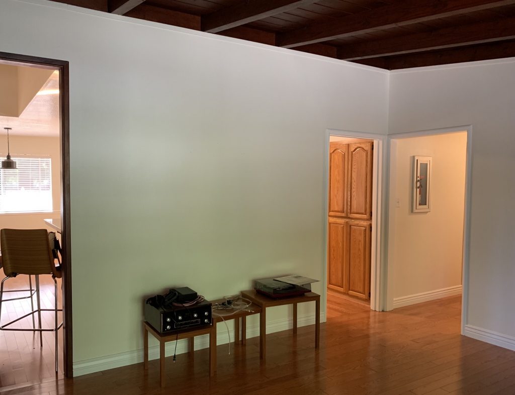
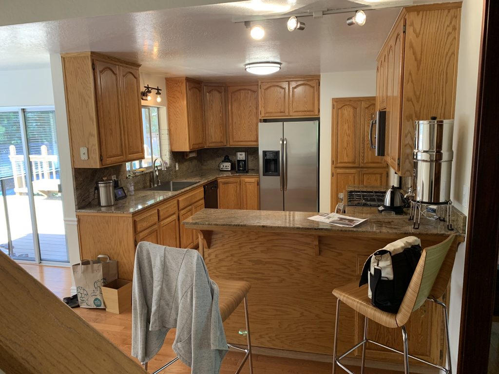
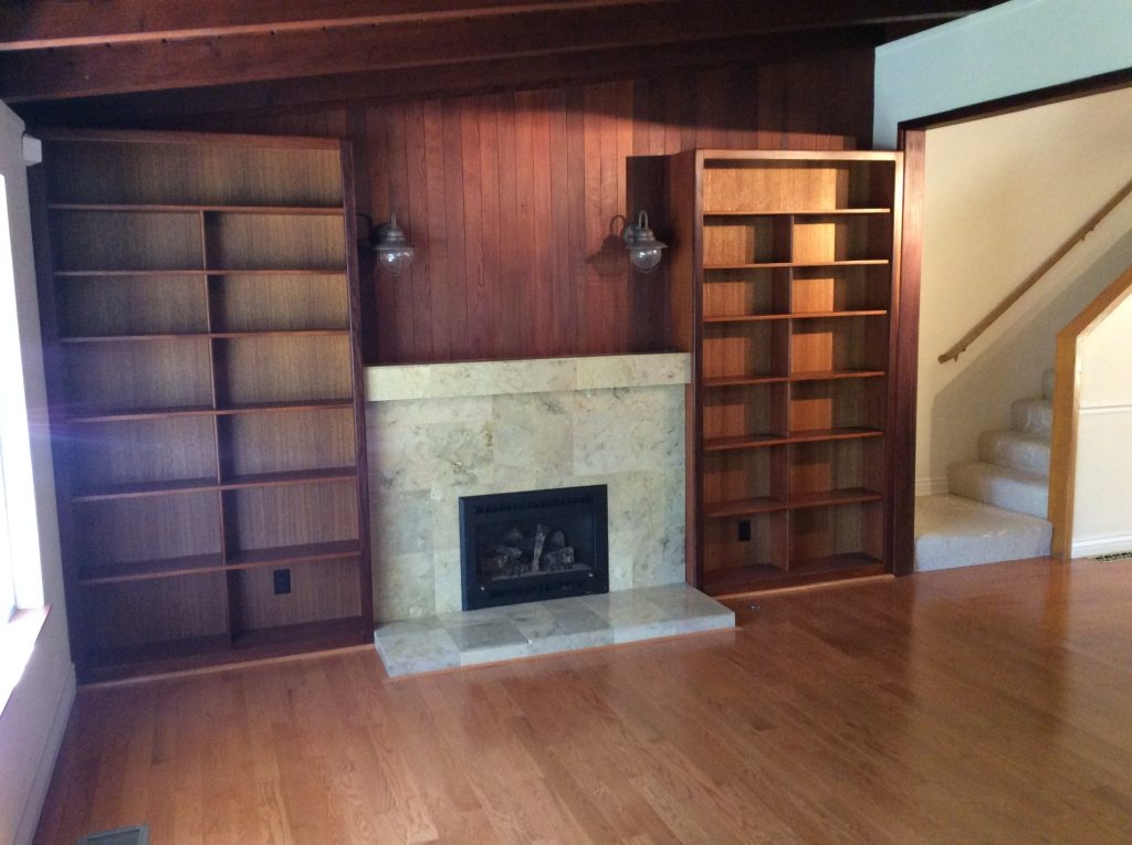
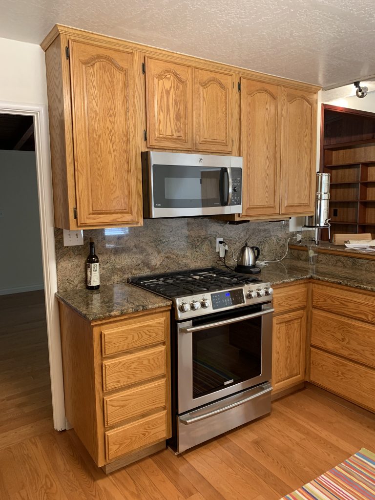
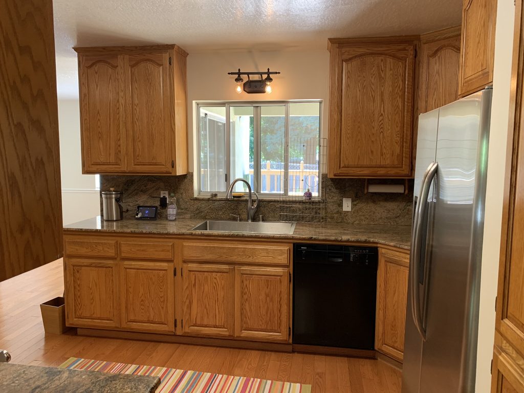
Their primary interest was in modernizing the kitchen and living room, which were adjacent to one another and both were very dark. “We probably wouldn’t have purchased this house without some improvements,” notes Phil. They wanted a lighter, brighter space and an overall open concept.
Open was, however, a challenge in and of itself as it involved removing a load-bearing wall between the living room and the kitchen. It was a major structural undertaking as a new beam would be needed to support the second floor. It actually affected supporting the roof load too and was to be concealed as well, creating three separate engineering items to be resolved and completed first… especially considering California’s stringent earthquake codes… all of which was quite challenging.
AFTER IMAGE GALLERY
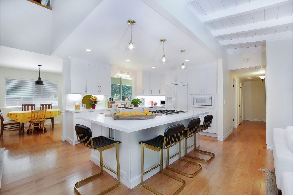
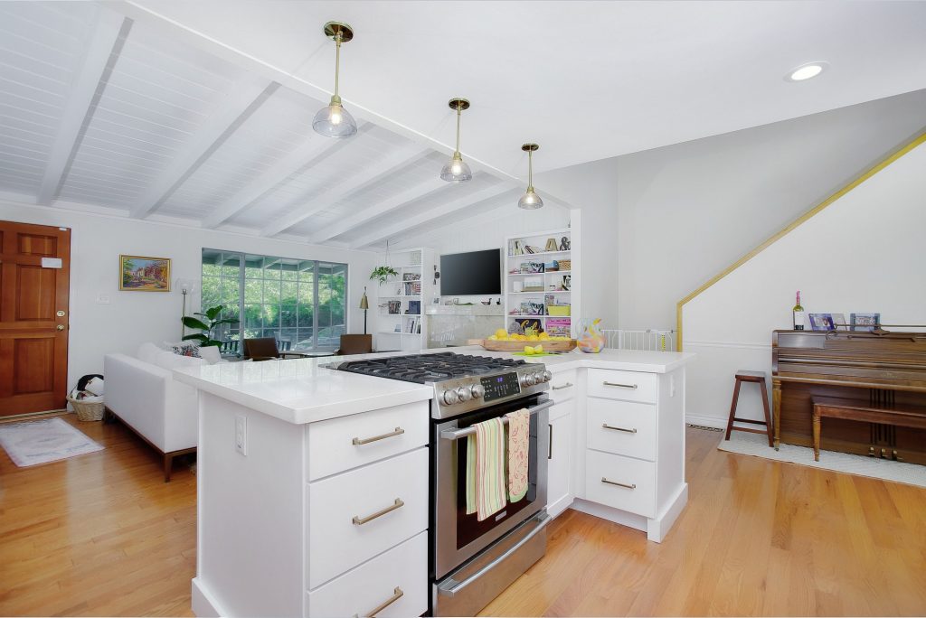
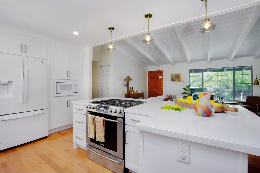
With the load bearing issues successfully resolved, and once the divider wall between the kitchen and living room came down, attention turned to re-designing the kitchen.
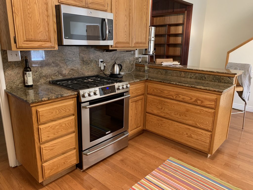
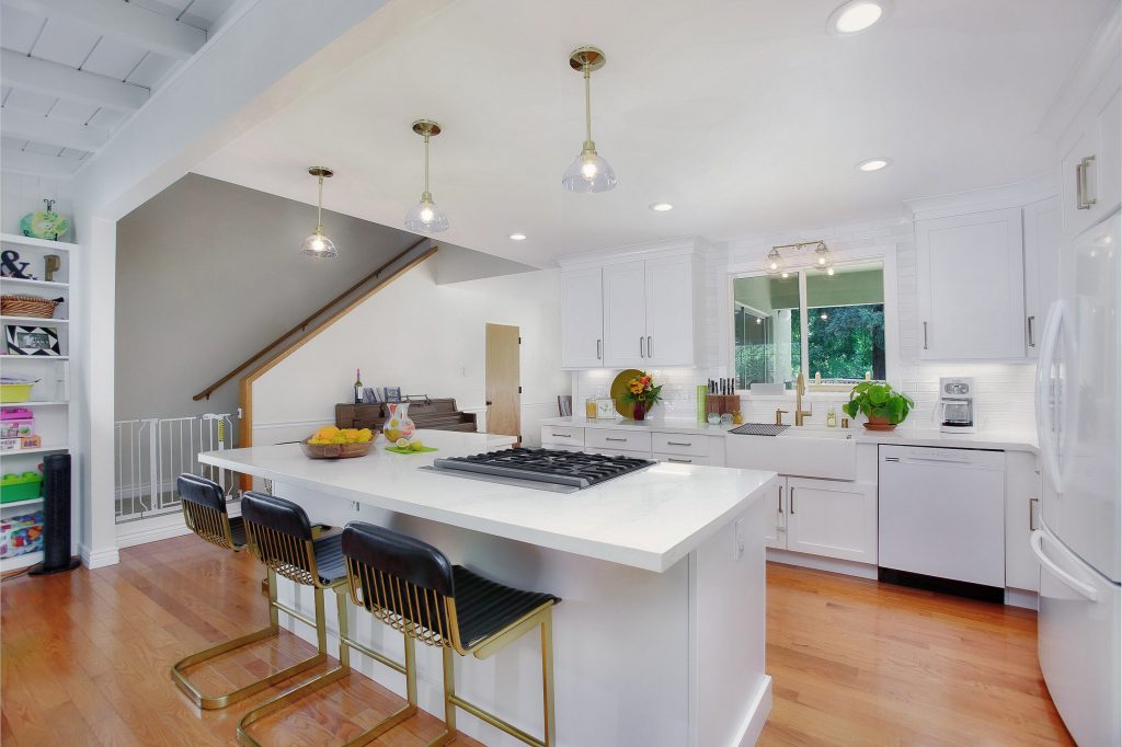
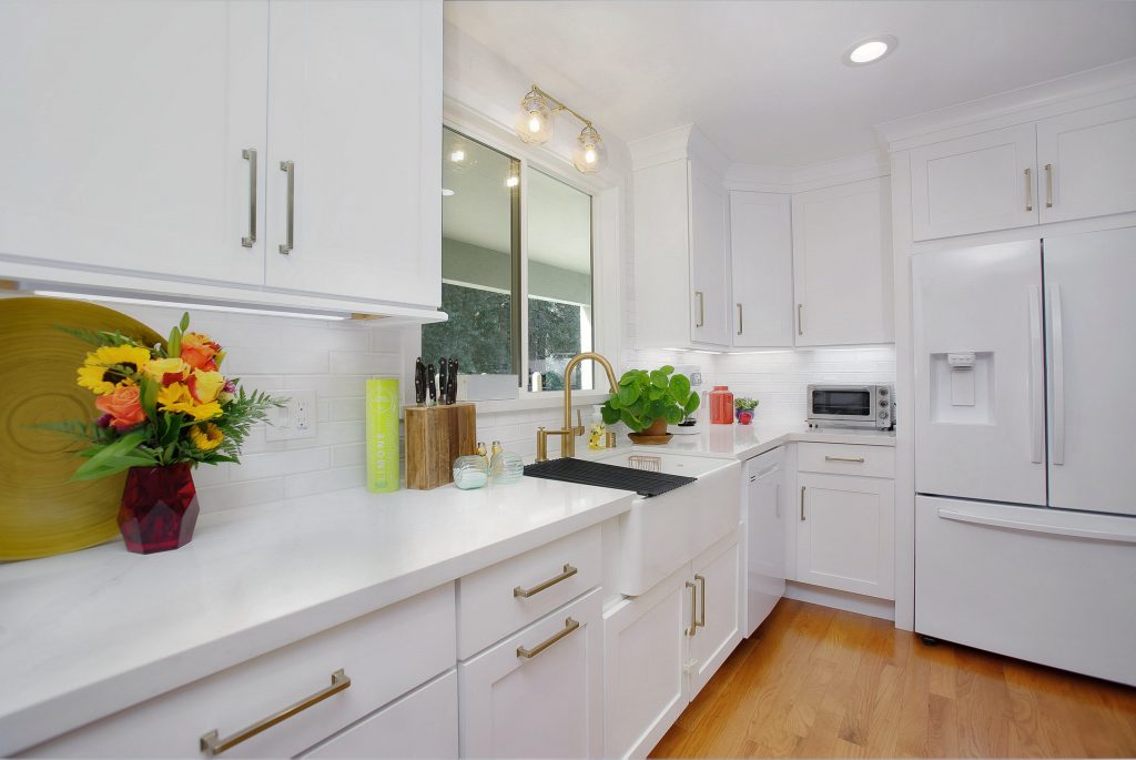
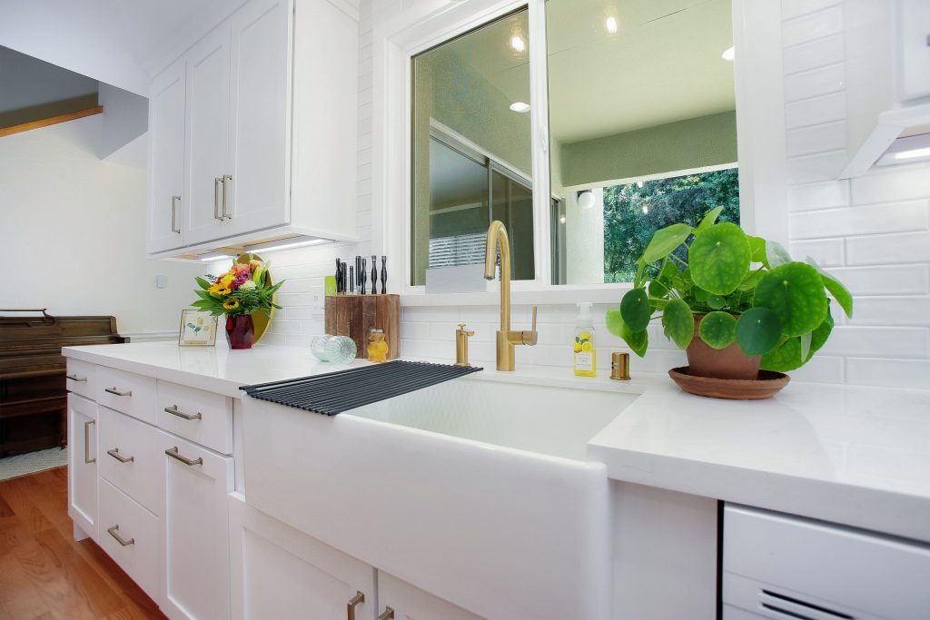
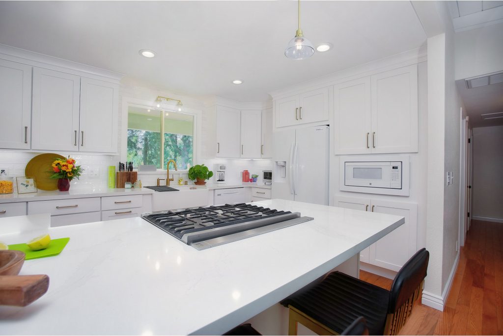
With the wall gone, it meant the cabinetry on that wall would need to disappear. We did, however, find a way to not only give them as much cabinet space as they previously had, but actually increased their cabinet space overall. Angie also wanted a larger window over the beautiful farmhouse sink and full tile backsplash for more natural light.
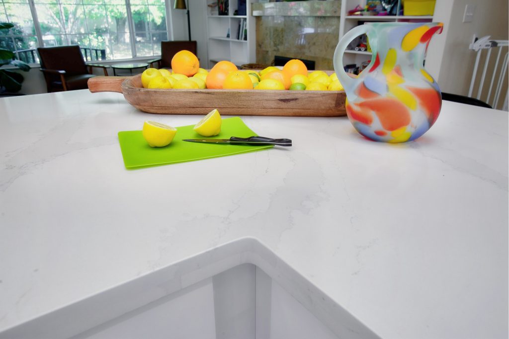
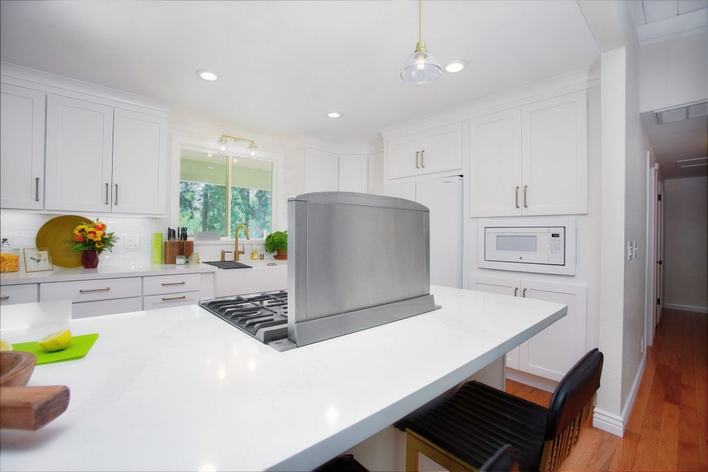
The answer was a really cool center island. In addition to designer bar stools, pendant lighting, beautiful shaker cabinetry and a quartz countertop, Angie selected gold for cabinet pulls and the lighting and plumbing fixtures. The original exhaust range hood was replaced with a show-stopping downdraft exhaust system that rises up like a periscope from the countertop.
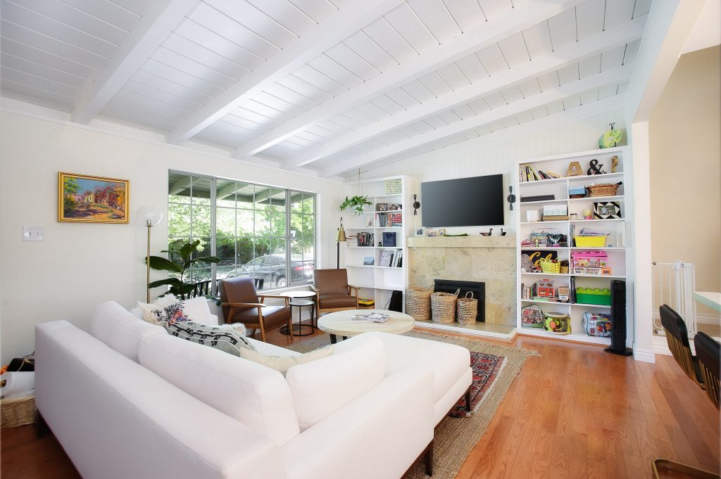
Step-by-step, the dark and dreary kitchen and living room transitioned into an open bright and white gold-trimmed designer space that met, and exceeded, every vision and desire of the Campos family.
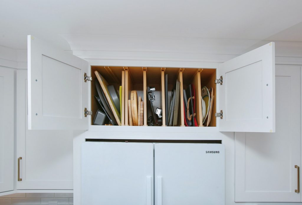
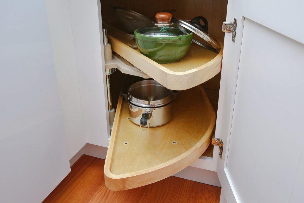
The new cabinetry included all the bells and whistles. Lots of pull-out shelves, soft-close doors and drawers and half-moon swing-out shelves for easy access corner cabinets. “We even relocated the microwave into the pantry for more counter space,” stated project designer Carol Carey.
“Everything was repainted throughout. The dark ceiling and bookcases were repainted bright white and we even matched the living room hardwood floor for one consistent look throughout. A new flat screen TV with decorative sconces above the fireplace completed the picture,” she added.
“So much thought went into everything,” notes Angie, “from the original design to any changes we wanted along the way… the Carey Brothers team made every effort to make it fit our purposes. They made it easy… and we love it!”
“It was sort of all in the family too,” says Phil. “Our families go back four generations and we’ve been listening to the Carey Brothers on the radio and reading about them in newspapers and magazines… we even have their Dummies books… and we knew who to call. We are so glad that we did.”
Phil and Angie… and their growing family… now have the beautiful bright, white and open designer “forever home” they always wanted.

